9/3/26
Hi Richard,
Yes, I can certainly add the figures of your three Labrador retrievers (yellow, black, and chocolate) to your painting..
I would suggest placing them off the corner of the building. Placing them small in the distance wouldn’t work as well because they would be too small to paint well, and they wouldn’t relate to the other figures.
Below are some images from the internet that we could use as a basis.
The cost would be $300 plus whatever royalties we need to pay to be able to use the photo.
If you decide to do this I will add the image to our composite photo for your approval.
What are your thoughts?
Best,
Linda
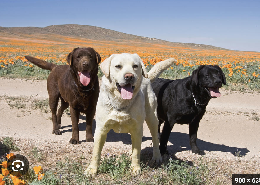
Labradore photo 1. This one won’t work quite as well because I need to change the perspective, as this photo is taken from a very low viewpoint.
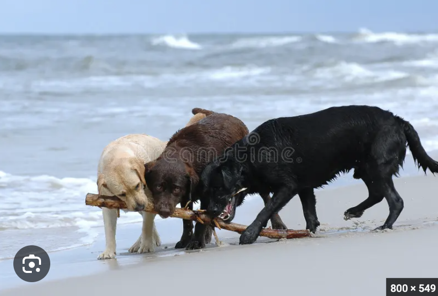
Labradore photo 2
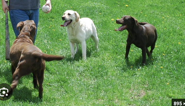
Labradore photo 3
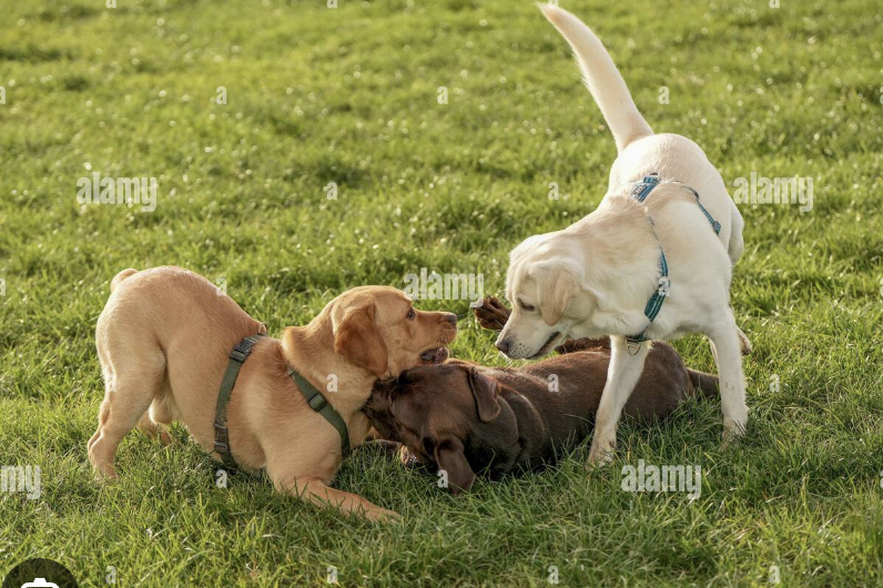
Labradore photo 4
8/19/26
Hi Richard,
I’m so glad you like the color sketch! I’ll go ahead and start the full-sized painting.
Regarding the additional requests, I can make the following changes from the sketch:
Make the sky brighter blue.
Add a yellow spot in little John’s shirt to indicate a Batman logo.
For middle Sadie, make her top turquoise instead of red
For middle Adelaide I can put her in a short dress that looks like the pineapple dress photo you gave me, below.
The final version will include an indication of the colored panes in the building’s three large arched windows.
Regarding adding three goldens in the distance, let me think about that and get back to you after I draw out the large canvas
I’m looking forward to starting to paint!
Warmly,
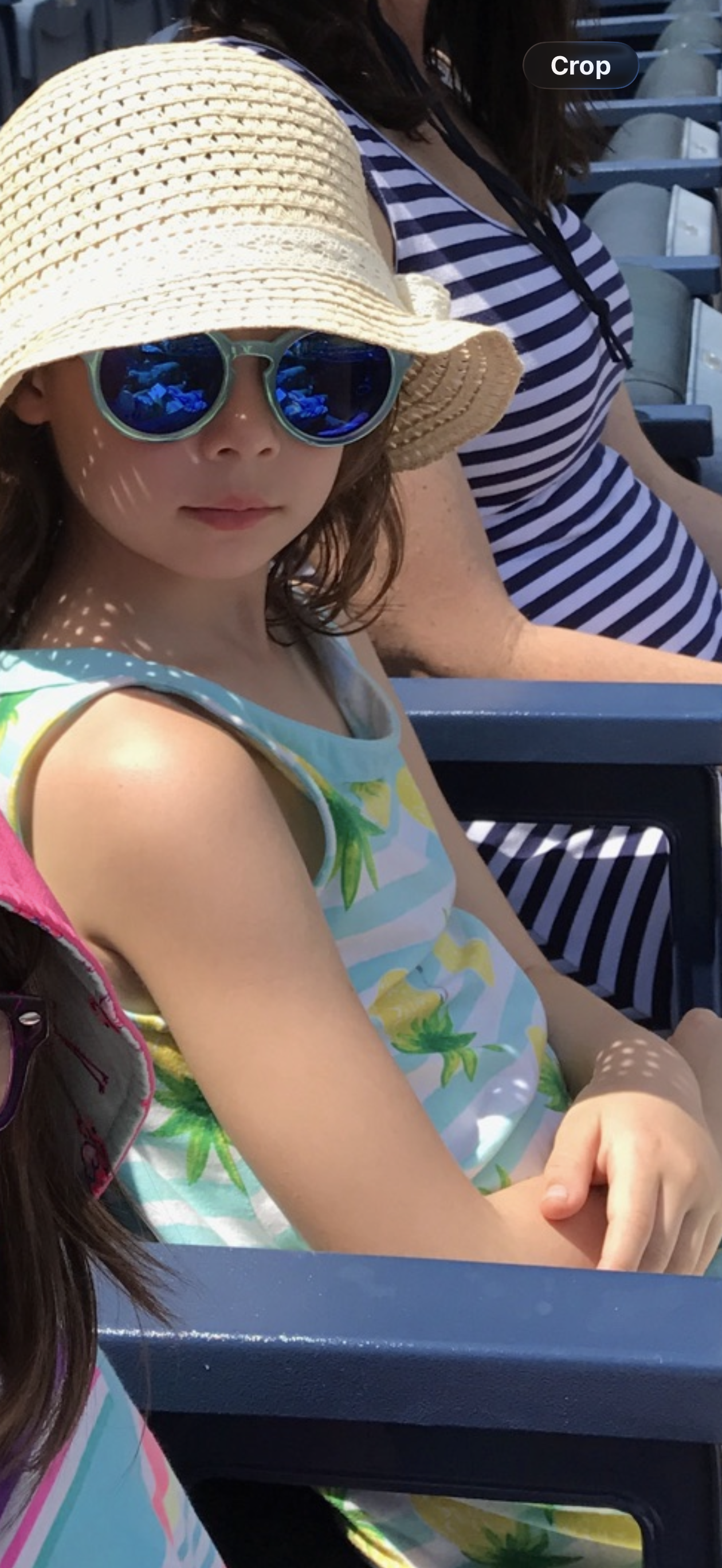
Adelade in her pinapple dress.
8/14/26
Hi Richard,
The color sketch for your commission is finished! The purpose of small painting is to generally decide on the colors and see how they work together. As you can see it’s very loose, and I didn’t try to show detail at all.
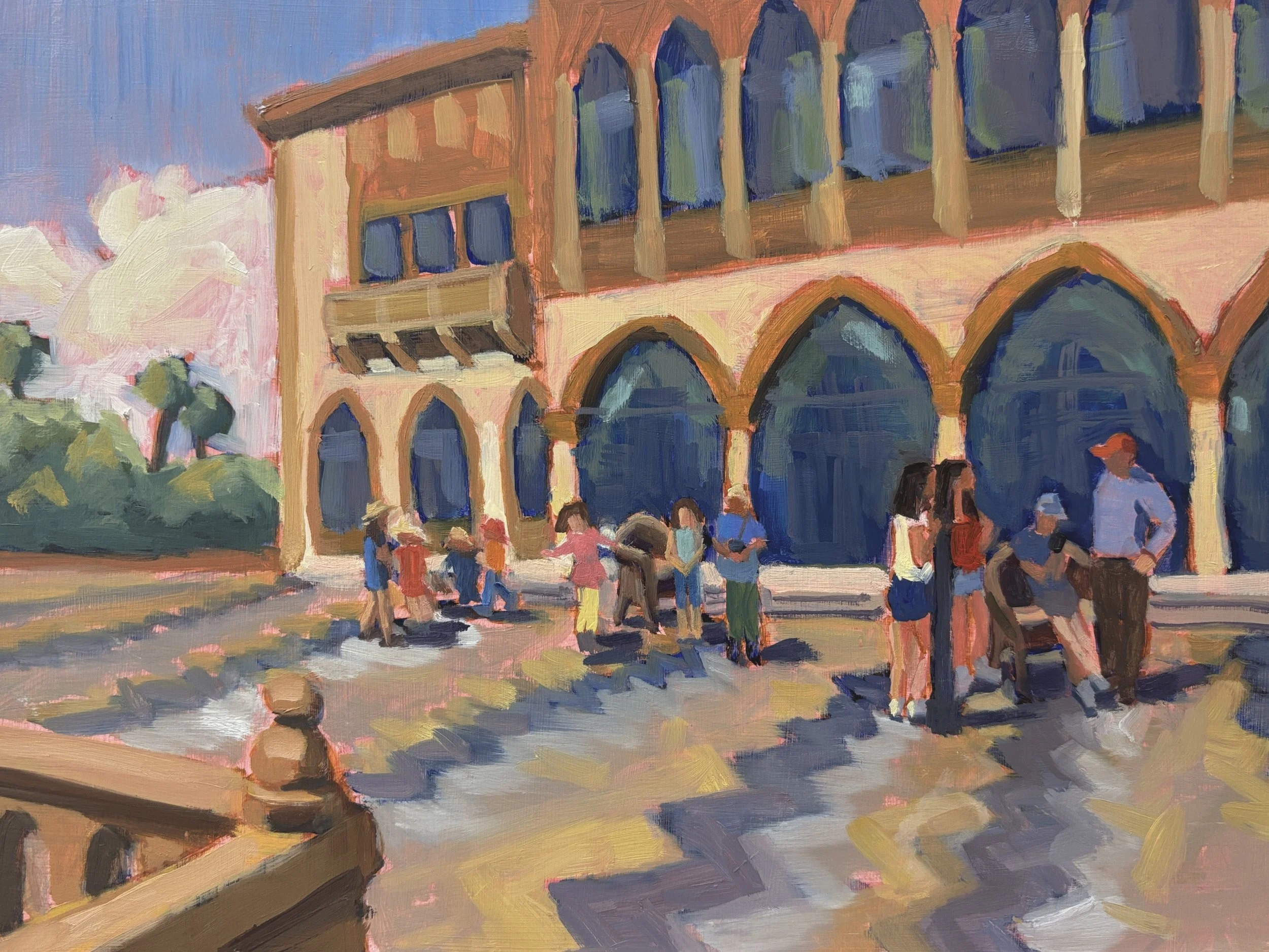
Lawson color sketch
A couple of things I wanted to point out to you:
I added your baseball cap and as well as some red in the other people’s clothing to work with it.
I toned down the value of the dark grey ziz-zags on the patio so it wouldn’t compete with the darks in the building. I wanted them to be distinctive, but not take over.
I made changes to some of the clothing colors to make them stand out from the background and to create color harmony.
I added clouds in the background to create a soft shape to contrast to all the hard lines of the building, patio, and railing.
I hope this looks like what you were thinking about. Once you approve this, I can get started on the painting.
Best regards, Linda
Approved Composite, #5 - smaller figures and railing
7/29/26
Hi Richard,
I did another quick value sketch based on the latest design, see below. While very sketchy I think it clearly shows that the painting will achieve what you’re looking for.
The first impression is the large scale of the Ca d’Zan in the strong sunlight. Next we notice the striking and complex designs of the facade and the terrace. Finally we notice the figures, which add a lively interest. When you look closely, you’ll recognize your family by their posture, clothes, and hair.
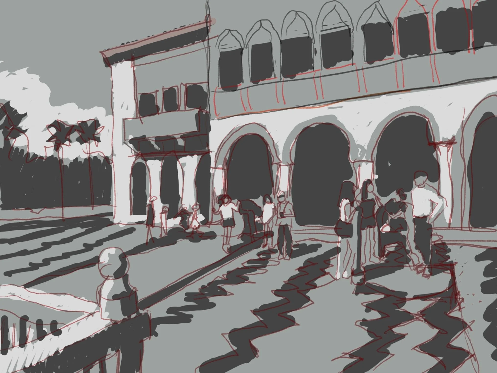
Value study for Composite 5
I hope you feel that is is more what you were looking for and we can proceed to a color study. I look forward to hearing your thoughts!
Best regards, Linda
Approved Composite, #5 - smaller figures and railing
7/16/26
Hi Richard,
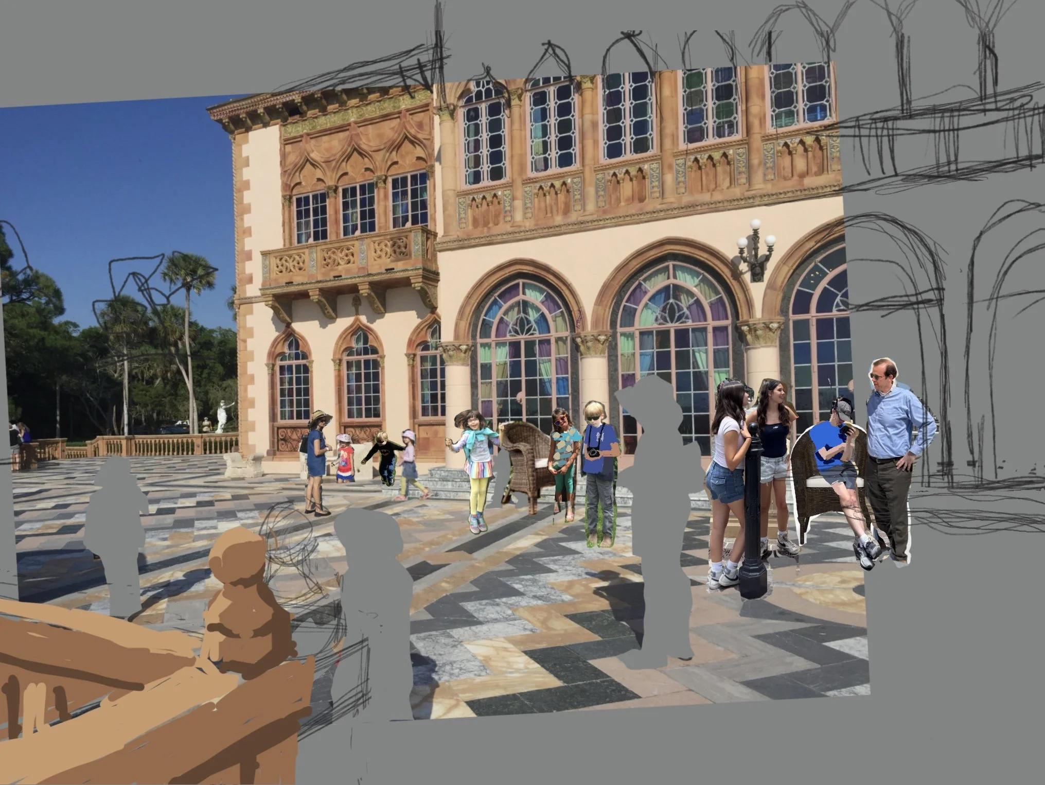
As you requested, I created another version of our composite that makes the figures considerably smaller, so that they are only a secondary part of the painting and not the focus. (Based on the 30×40” painting size the figure of Robin will be 3.9” tall and the one of you will be 7.7” tall. )
As you suggested, this new version makes the Ca’ d’Zan and it’s architecture more important and the fugures less important. It also means that the zig-zag terrace can be a bit more prominent because it’s not competing with the figures. To balance the composition, I added a section of the existing railing in the foreground on the left. I also separated the three groupings of figures a bit more so they cover the front of the building.
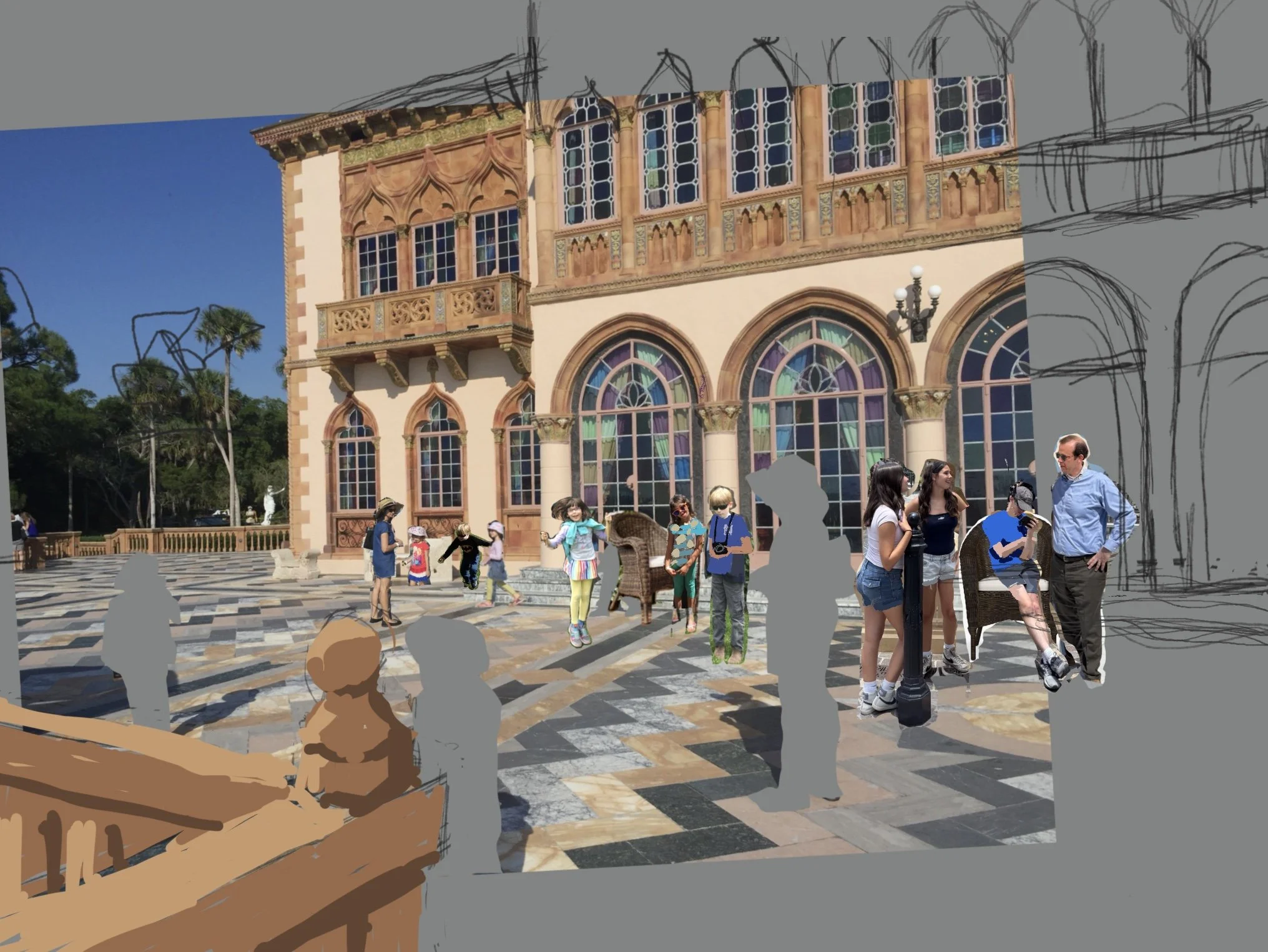
Composite 5 - smaller figures
Please note that in order to paint the figures as loosely as the rest of the painting, I will be showing much less detail. and no faces.
I think this version makes an interesting choice. So, which one is your favorite? I look forward to hearing your thoughts!
Best regards, Linda
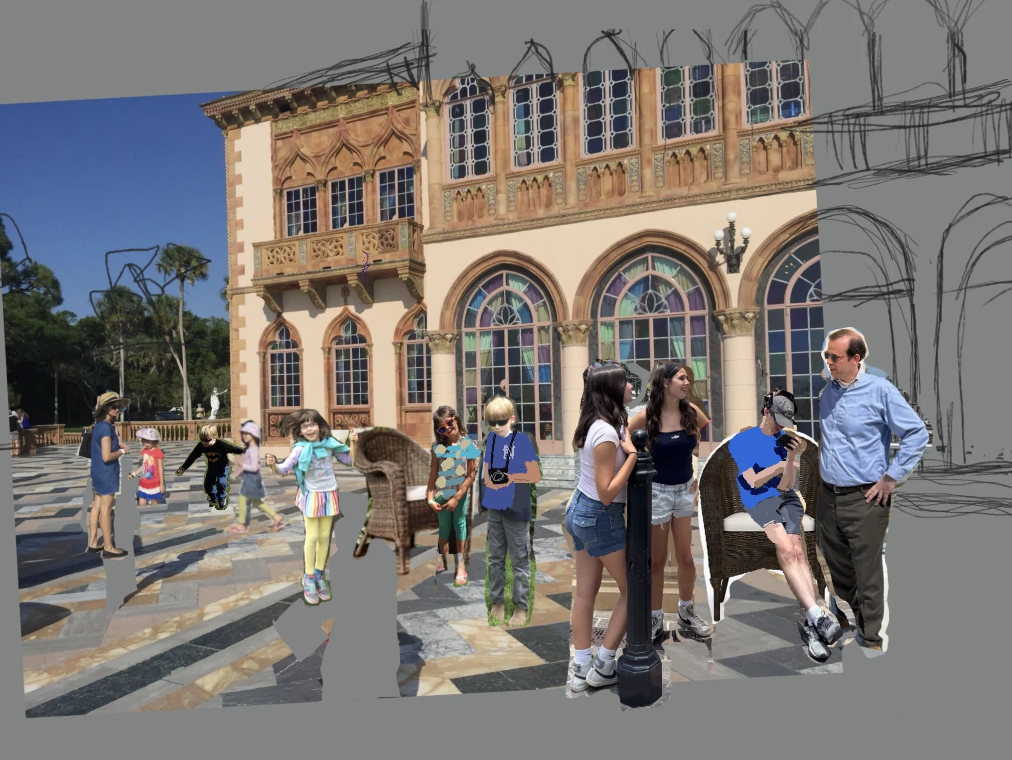
Approved Composite, #3
7/09/26
Hi Richard,
Your commission is moving right along! I’ve completed your digital value sketch. It’s below, with the photo composite you approved to use as the reference. The best way to view this sketch is to step back a few paces so you can see it as a whole.
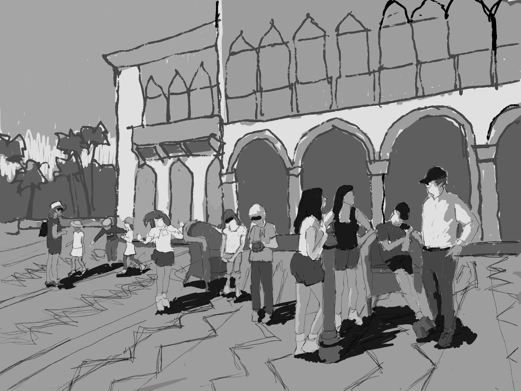
Digital Value sketch
The purpose of this sketch is to allow me to plan the values (dark and light areas) of the painting, which is what will give you the first impression of the painting as you view it from a distance. My arrangement of the darks, mediums, and lights is what also will move your eye around the scene, starting with you in the foreground and moving around the figure groups to the ones on the left.
Notice that while I have drawn the zig-zag pattern of the marble terrace, I have not shown it in a dark value.. Instead I plan to indicate that design subtly, because I don’t want the patio to overpower the figures and the house facade. There’s a lot going on in this scene!
A word of caution: please don’t worry about the way I’ve drawn any details, this is just a rough sketch for design purposes.
I look forward to hearing your thoughts on this design! Once you approve this, the next step to for me to do a small color sketch, to choose the color palette that I’ll be using for your commission.
Best regards, Linda
Approved Composite, #3
5/28/26
Hi Richard,
I made a third composite based on our discussion and your comments. Here’s what I did, from left to right:
BACKGROUND
Switched the figure of John to the one with the Batman shirt that you liked, and repositioned the twins to work with his pose..
MIDDLE GROUND
Removed the jump rope from Sadie,
Switched out the figure of Adelaide because the jacket and her leaning over didn’t work. I have added colors that indicate her pineapple shirt .
Removed John’s jacket and gave him a Yankees T shirt. Took off his gloves and gave him a camera per another of your photos.
Added a chair like the ones at Ca’ d’Zan to balance the composition
Made all the figures in this section a bit taller, to better relate to the foreground figures.
FOREGROUND
Lengthened Sadie’s and Adelaide’s shorts.
Gave John a chair to sit on.
Removed Robin from the grouping and repositioned the remaining figures.
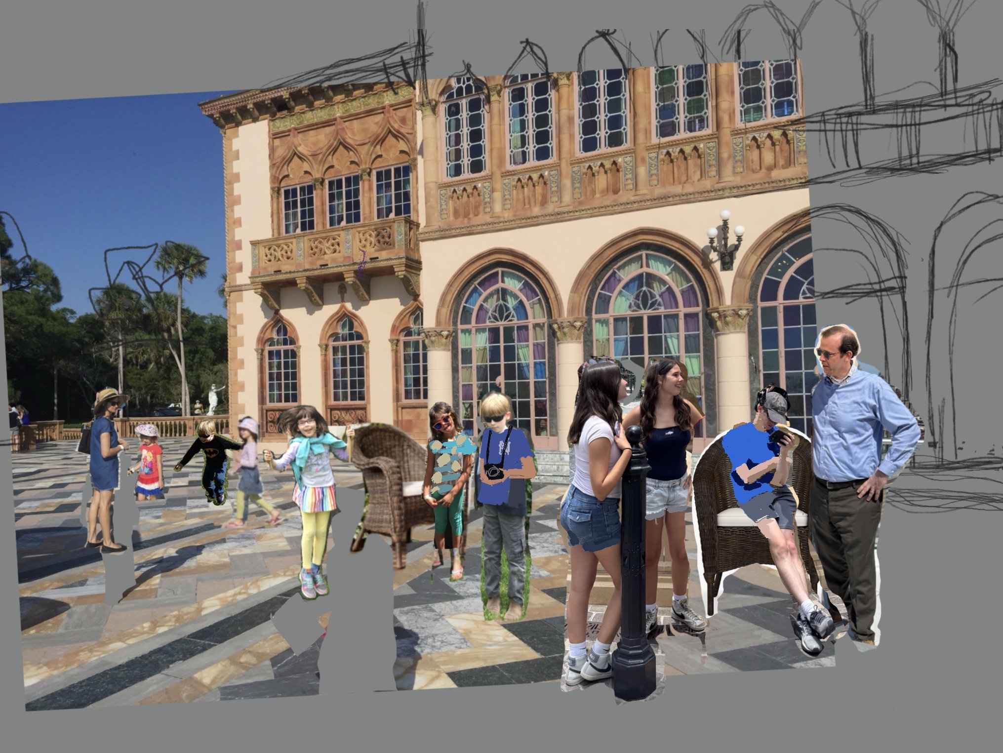
Composite No. 3
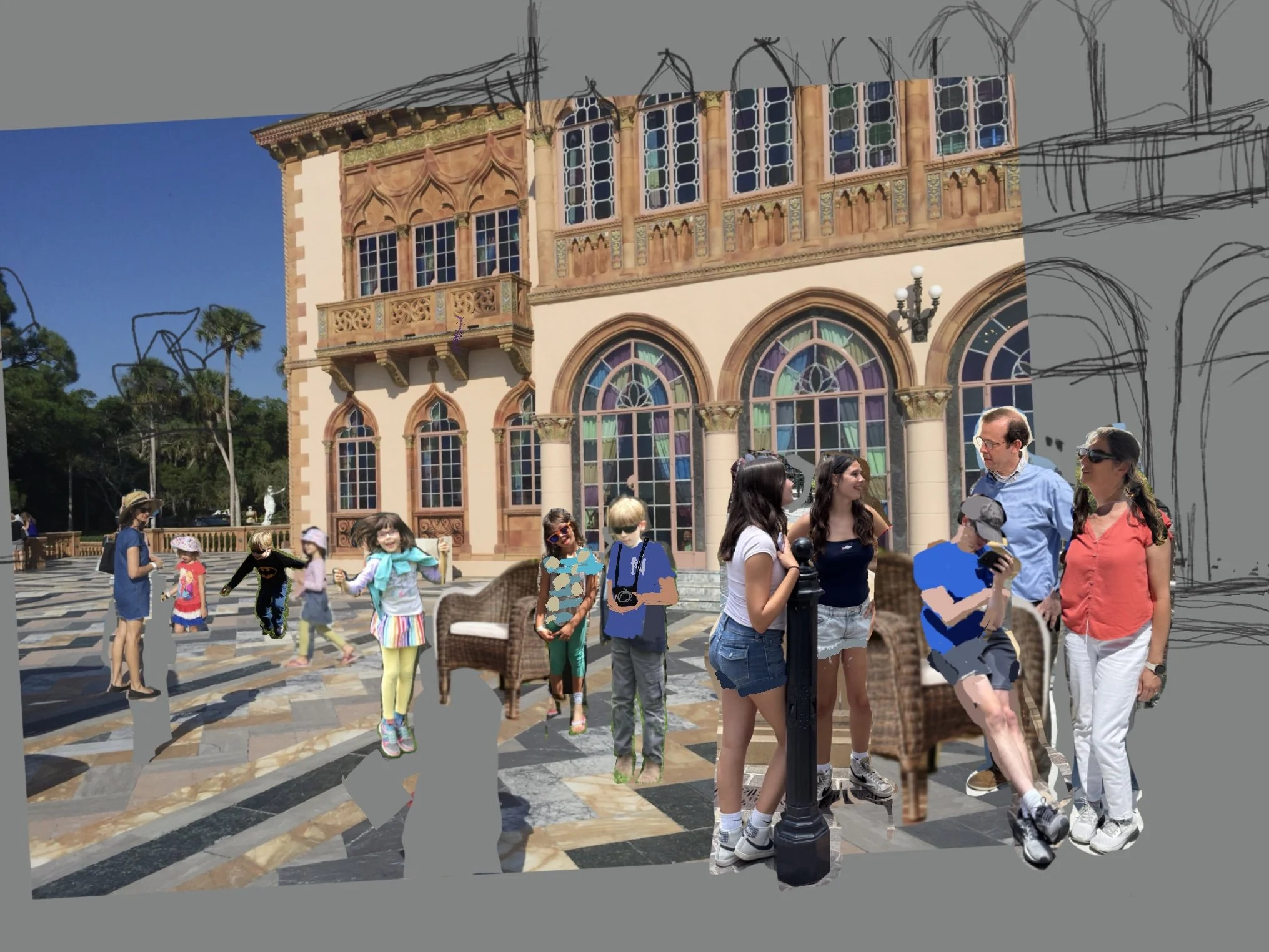
BUT… as I continued to look at the composition, I was concerned about the placement of Robin. I felt that she was left out of the family dynamic, being so small and distant.
So I did another composite (number 4 below) that adds her to the front grouping, using the body from one photo and the head from another. I’m happier with this because she now seems to be an important part of the family. What do you think?
Composite 4
I need to touch on how much time I’ve spent on these revisions since our initial meeting. I’m finding that this is taking a lot longer that I originally envisioned. This is our fourth version of the composite; I’ve reviewed your 28 photos and used pieces of 10 of them, plus photos from the internet. My image file now has 20 layers, and the 11 separate figures have been modified for size, orientation, heads, and clothes, most of them multiple times.
All this is to say that while I appreciate the opportunity to fine tune your design until you (and I) are very happy with it, this project stage is taking much more time than I originally anticipated. So I am requesting an additional $200 for this last round of changes. If you agree I will add it to your final balance.
I’m looking forward to hearing your thoughts on the latest revisions!
Best, Linda
5/14/26/26
Hi Richard,
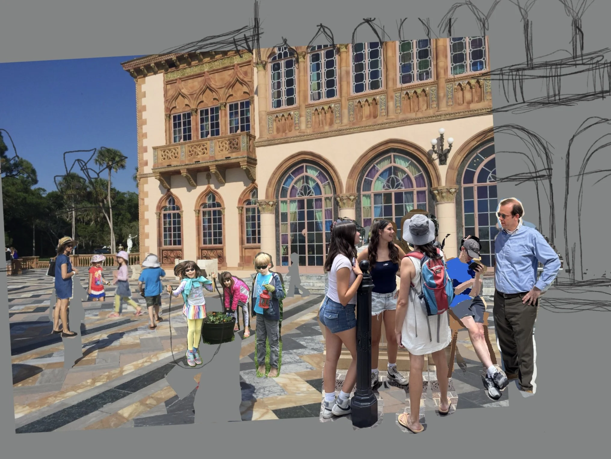
I made a new composite based on our discussion and your additional photos. What are your thoughts? I’d love to have another Zoom call to discuss this.
I’m available in the morning tomorrow, Friday 5/15 after 9:30 , or next Wednesday morning 5/20. What works for you?
Best, Linda
4/10/26
Hi Richard,
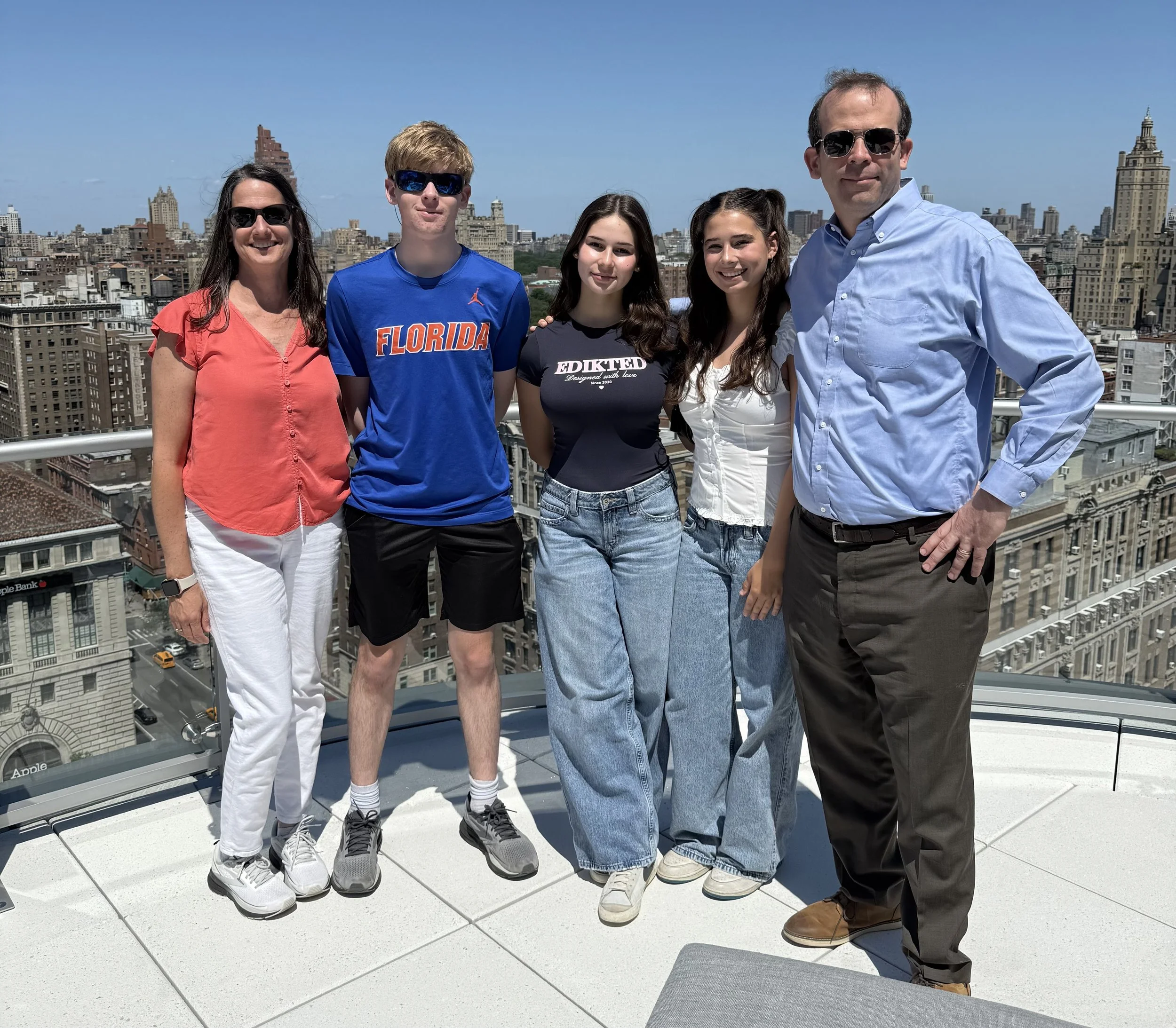
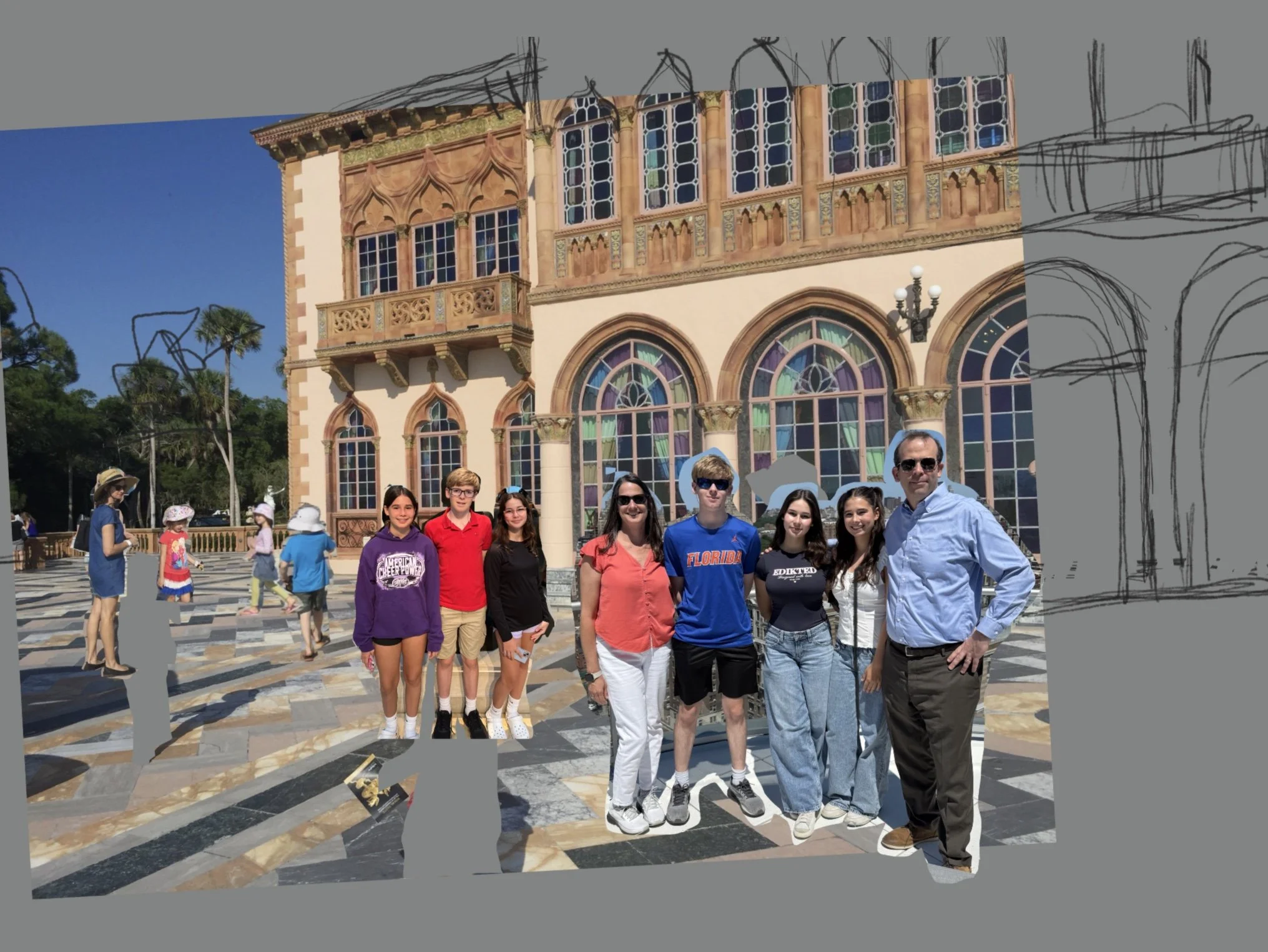
This is your webpage where we’ll communicate about your commission. Today we’ll take a first look at a composite of some of your photos and think how we might want to modify the design.
PRELIMINARY COMPOSITE
This is a first pass to think about what photos we could combine and how they will look together.
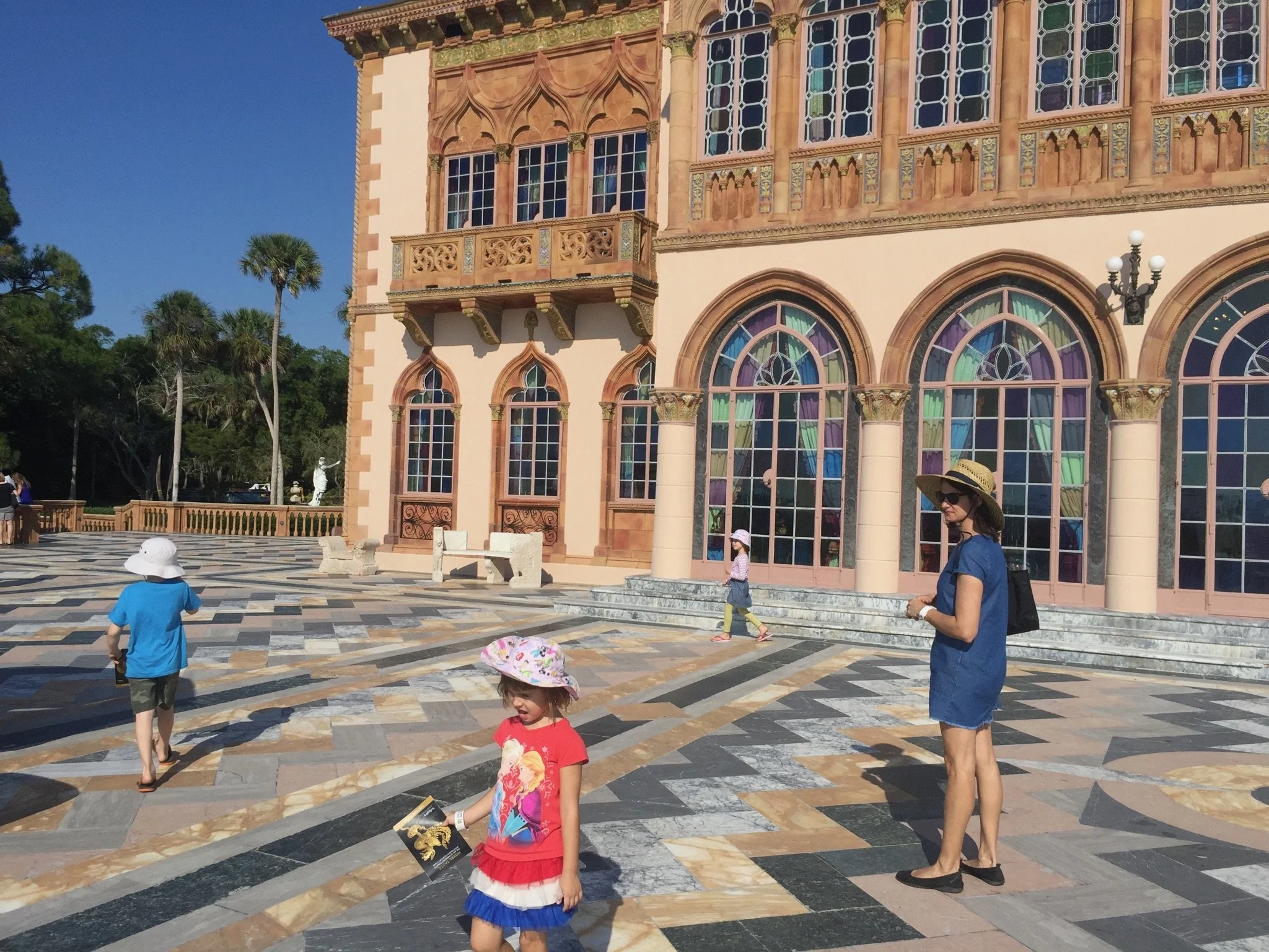
I’ve shown this on the proportions of a 30×40 canvas, which I think would be a good size for the amount of figures we want to include.I did make the canvas show more than your photo did on the right; I think it would be nice to include more of those beautiful arched windows and to make the Ca’ d’Zan even more important.
MY THOUGHTS
This will make a beautiful, emotional painting that suggests the passage of time and a family that enjoys being together.
I like the scene in the background with the three kid just walking aimlessly and your wife watching them but also a bit lost in thought.
The foreground is a great shot of you all together. It will be the most prominent grouping of the figures since it is the closest. I would probably change the colors of clothing to better coordinate with the painting’s colors. And I would prefer to paint pants on your son, because the shorts seem to draw the eye.
MORE PHOTOS?
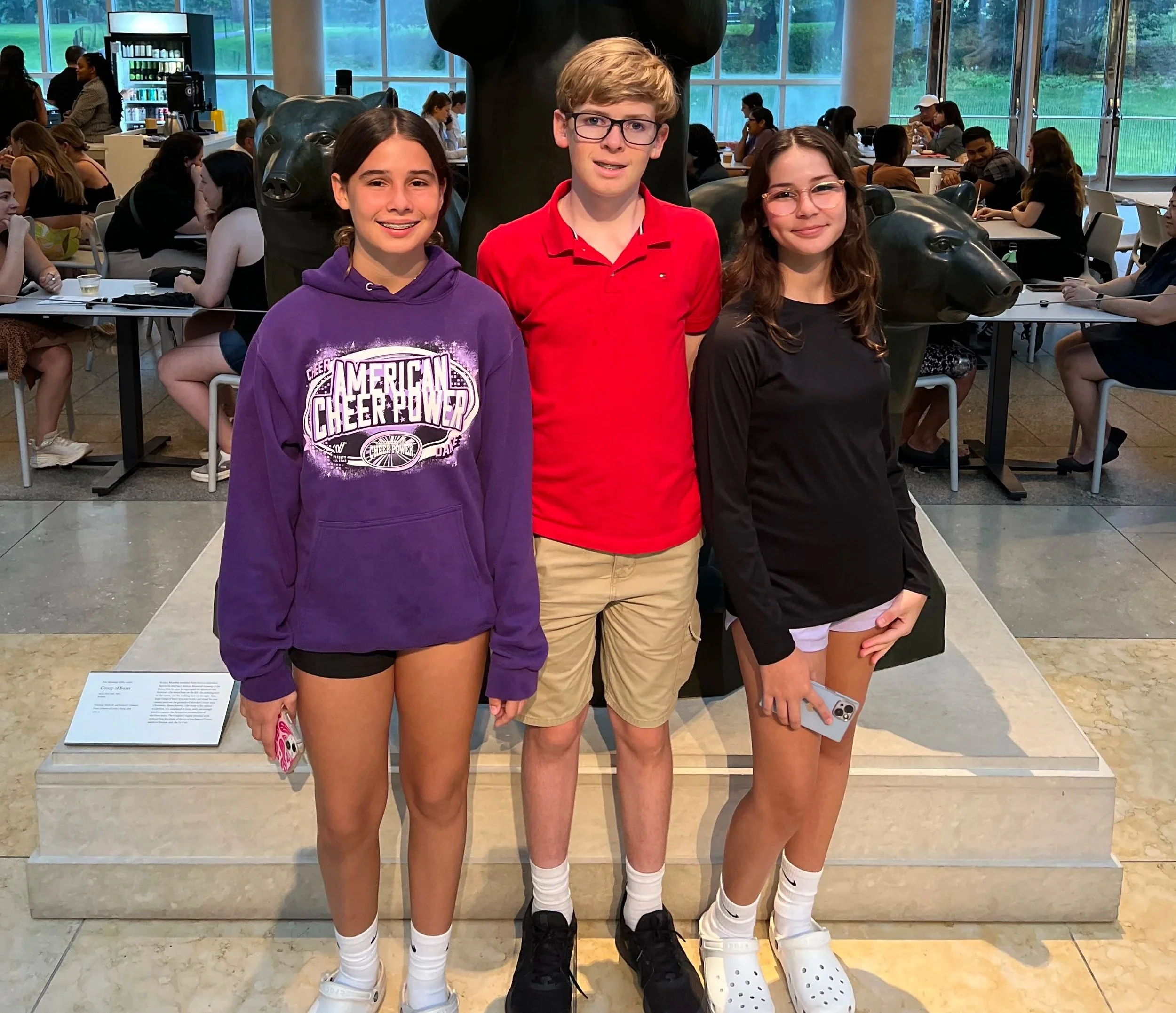
The middle grouping is my least favorite. It’s a lovely shot of your children in middle school, but I would prefer a scene that was a pit more active and less posed. That way the only posed grouping is the current one. Can you take another look at your photos and see if you have any more full length photos of them at this age?
WHAT’S NEXT
Let’s talk about this over the phone or on Zoom. I would love to hear all your thoughts.
If the 30×40 seems like a good size for your then I can give you a price once we confirm the scope.
On Sunday Chris and I leave for two weeks in Portugal (!!) so I would like to connect soon if possibln. I’ll suggest some times in my email.
Best, Linda