8/19/25
Hi Michael,
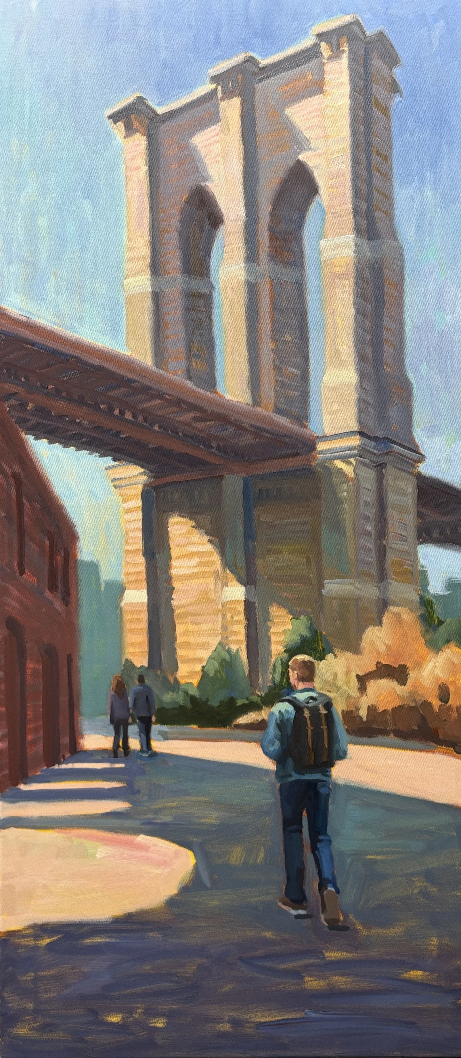
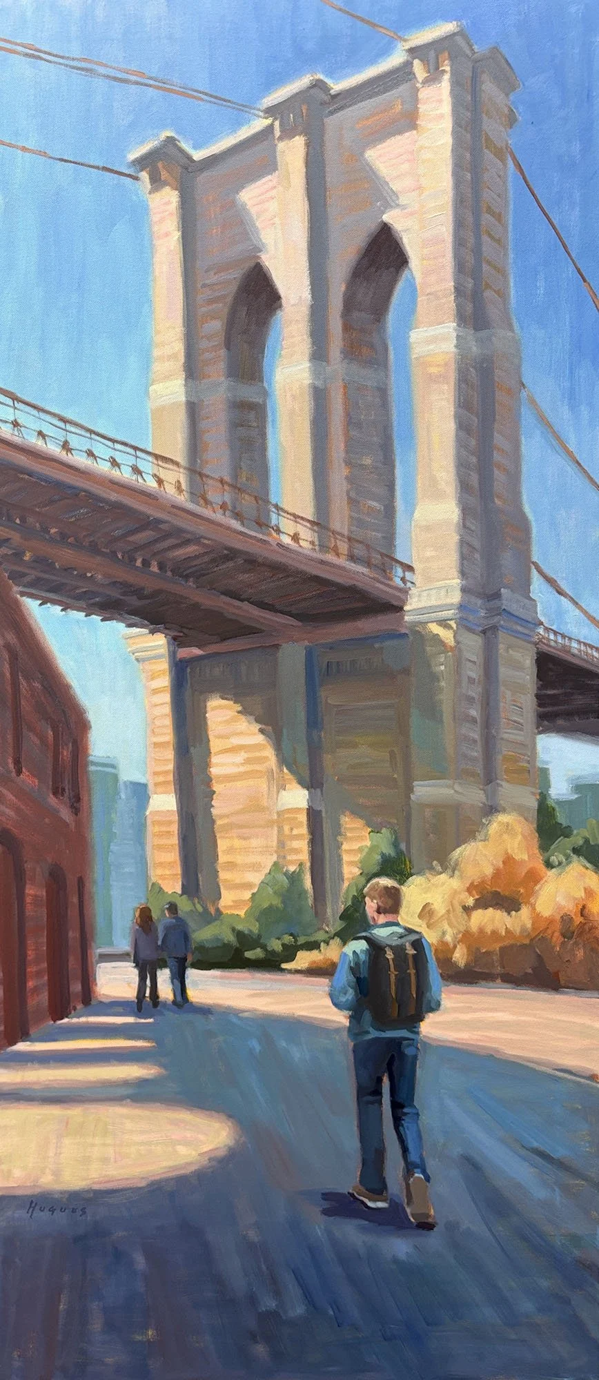
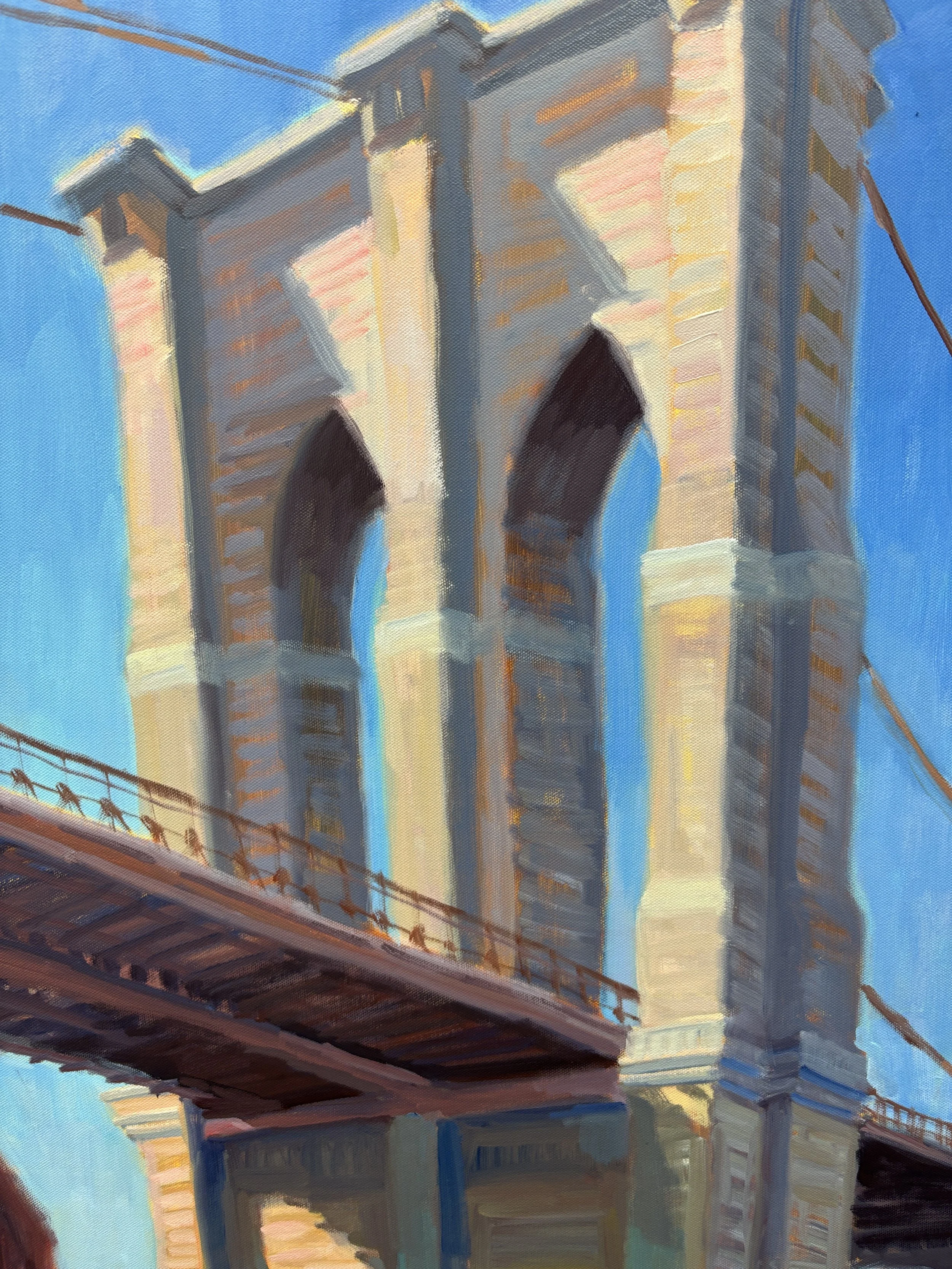
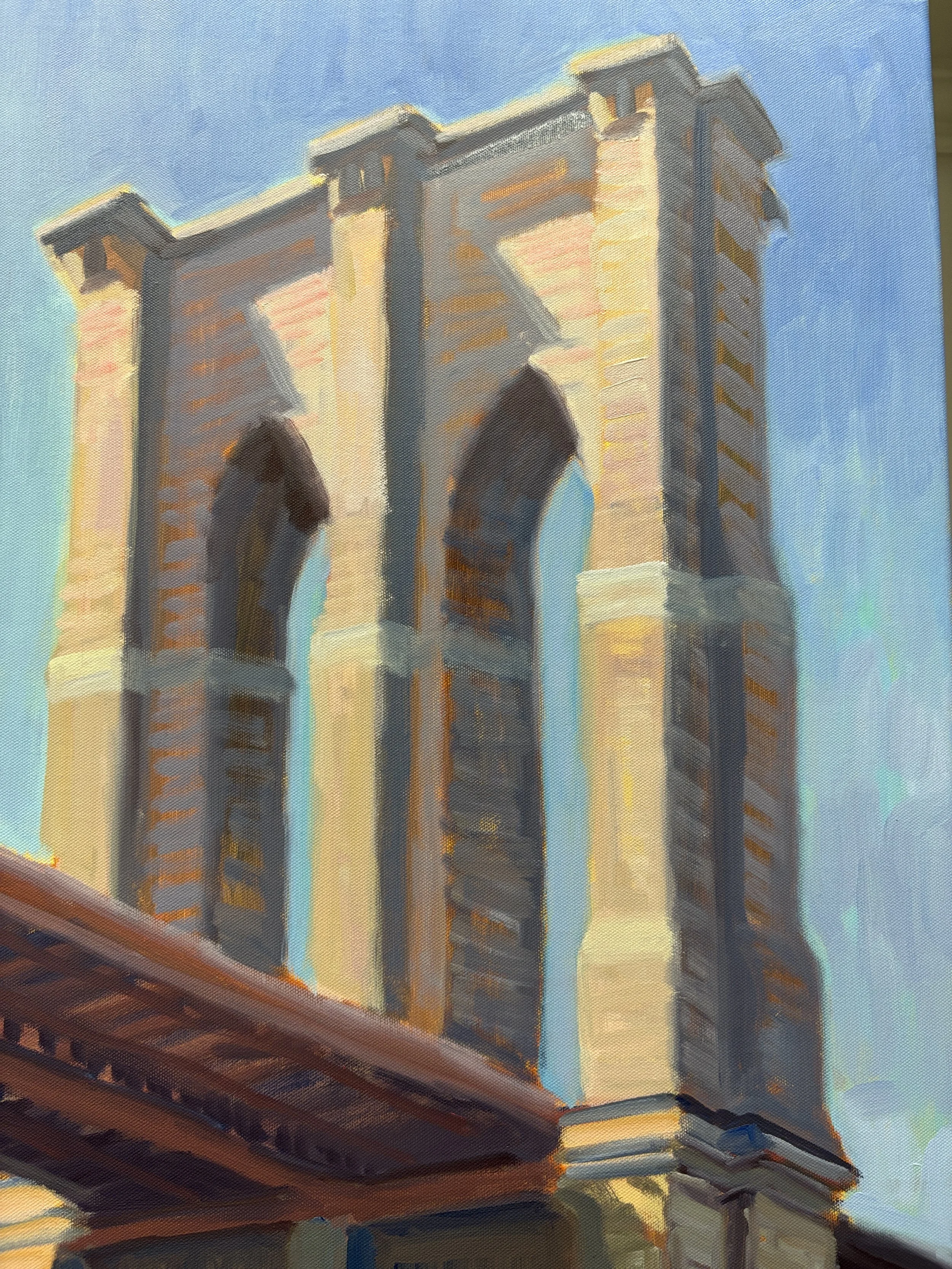
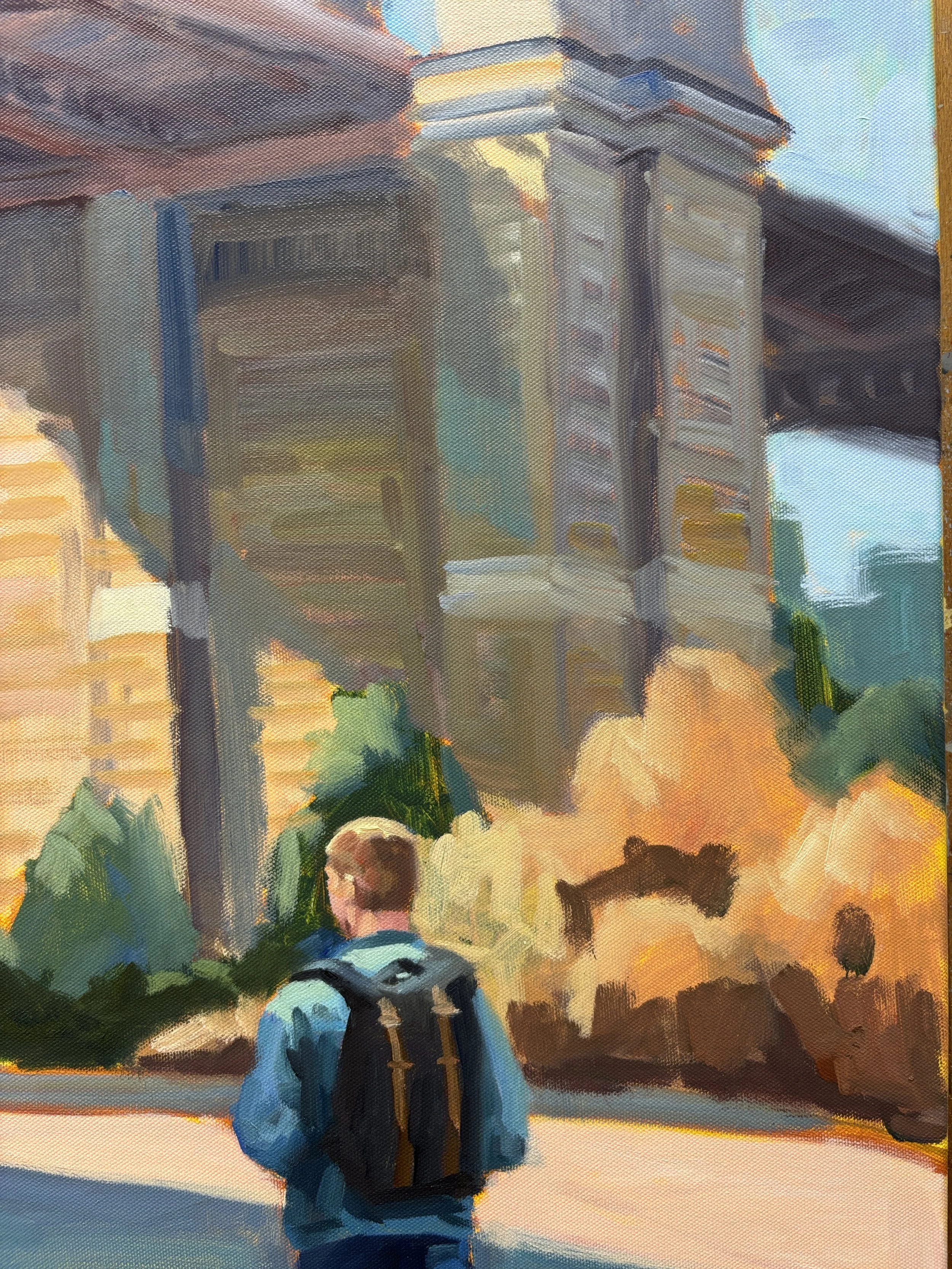
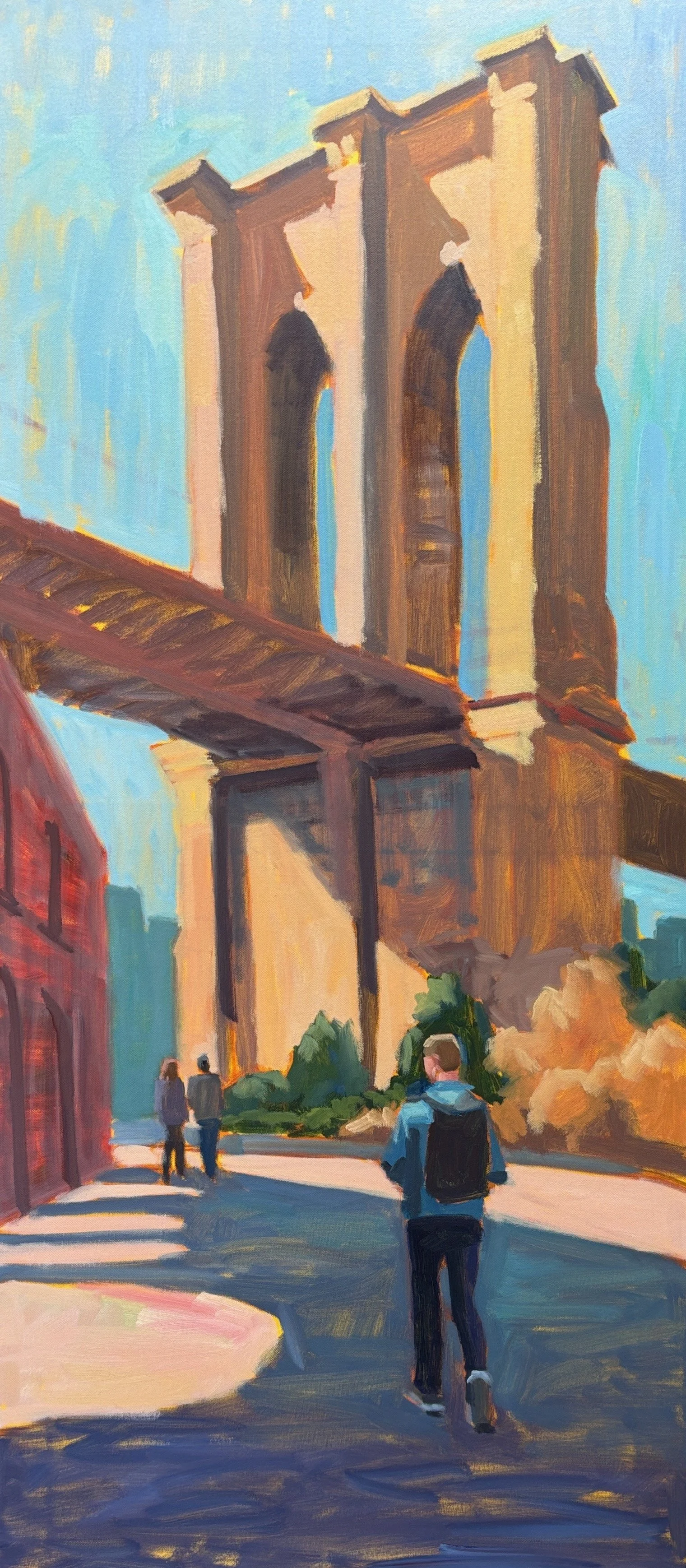
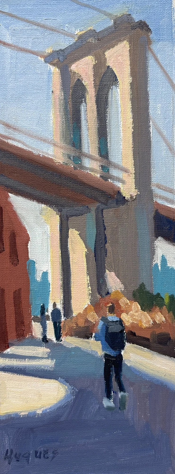
It’s finished!! I’m really pleased with your painting. You photo is the perfect composition for this unusual size and I think it makes a powerful statement.
7/24 progress
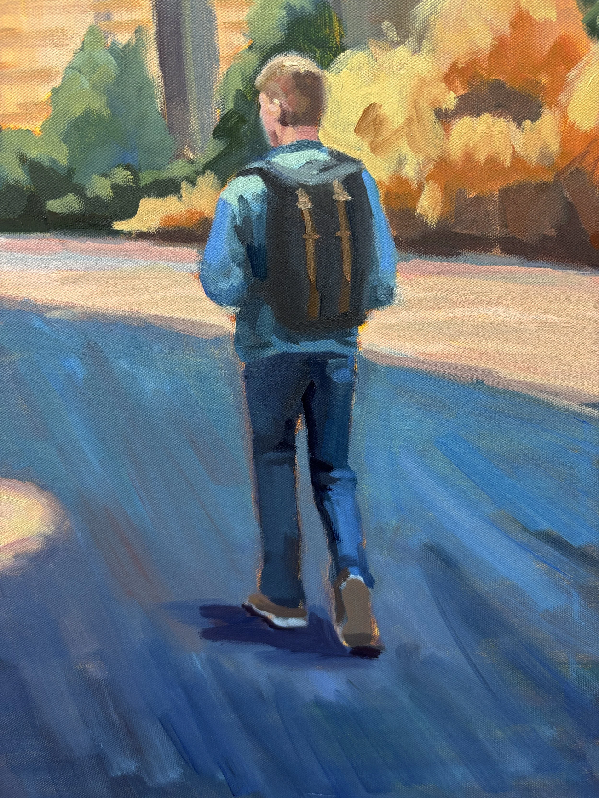
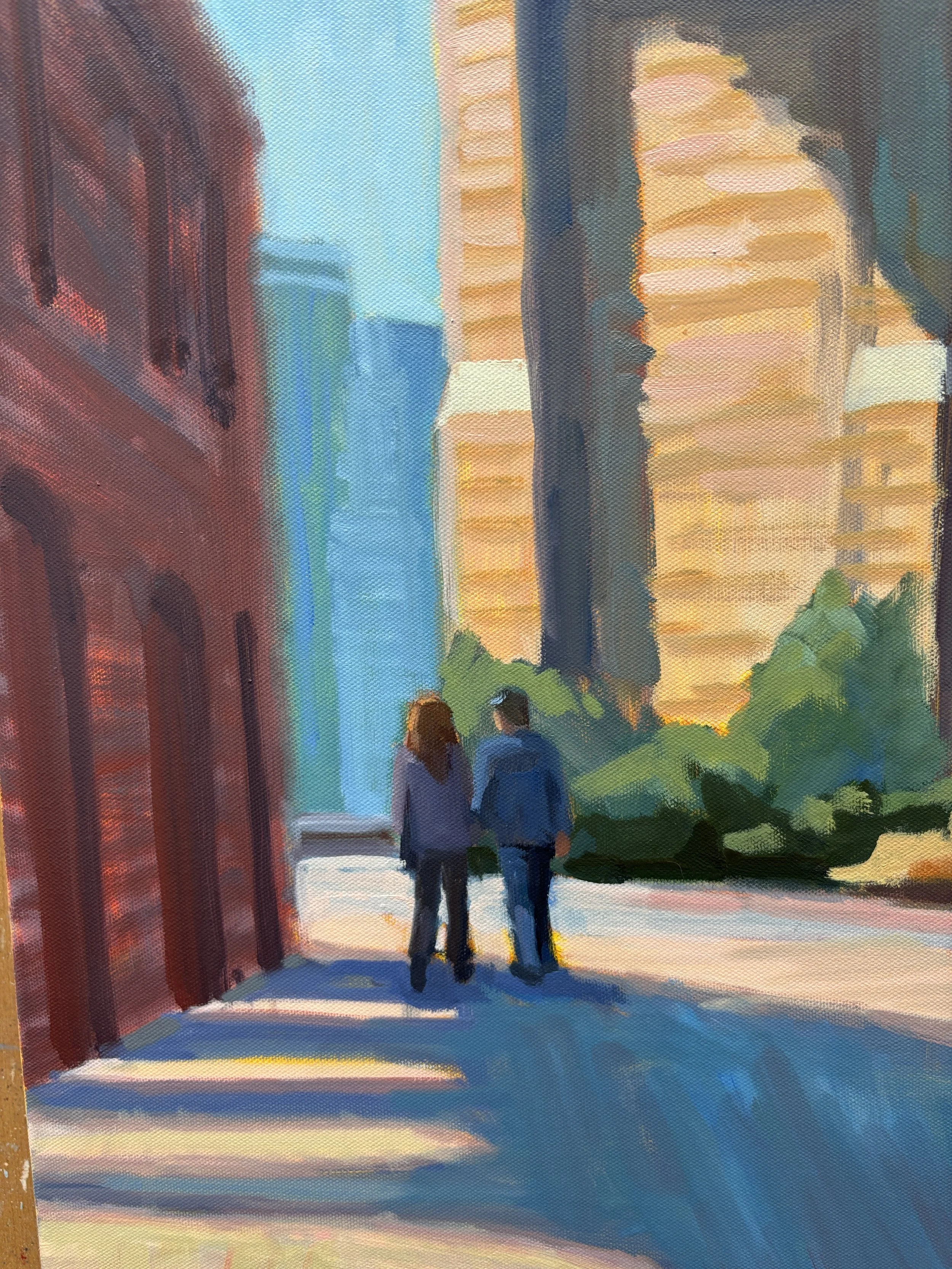
Detail 1
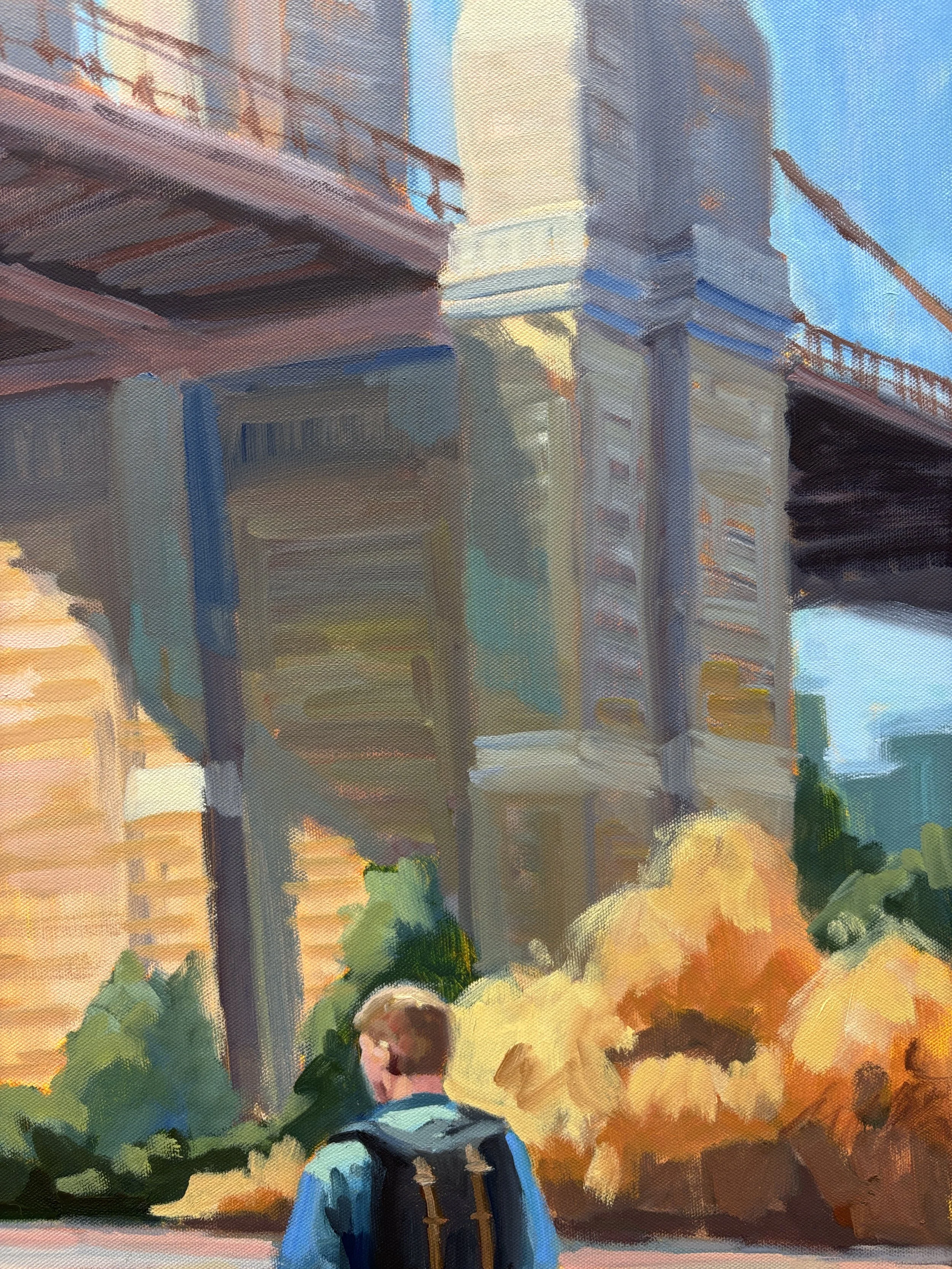
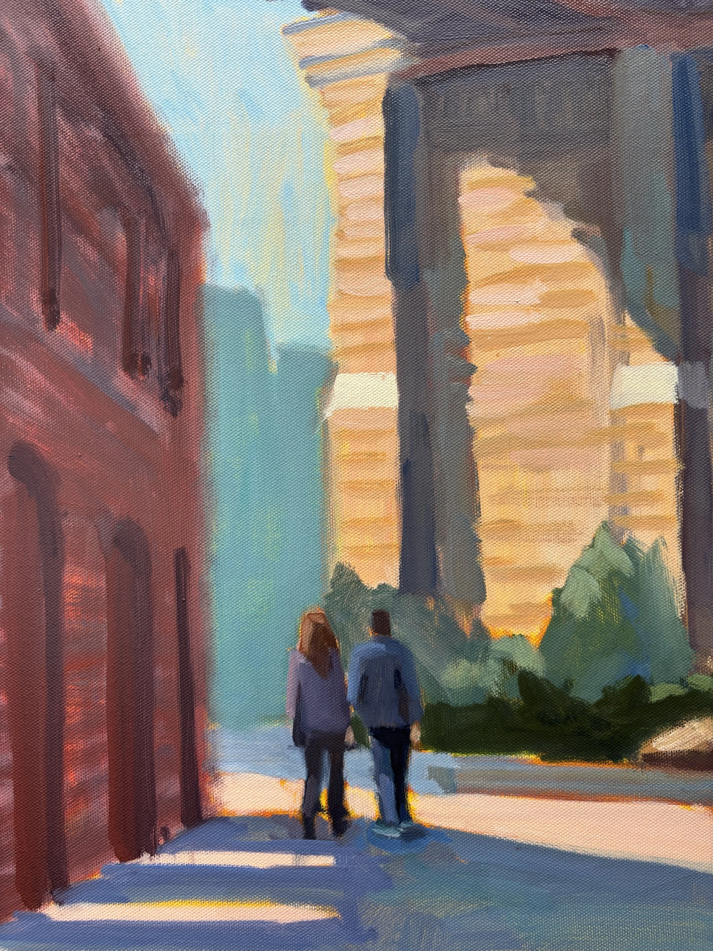
Detail 3
I can’t wait to hear what you all think.! Once I’ll get your input, let it dry, varnish it, and it will be ready for shipping.
As usual, you can use this link for your comments I can’t wait for you all to see your painting in person!
Best, Linda
P.S. I so appreciate so patience and understanding while I help my mom. She’s doing better, but now she’s going to be moving into assisted living so I’m doing a downsizing and managing the move, as well as all the other care issues. But slowly, it’s all getting done.
Finished painting
Detail 2
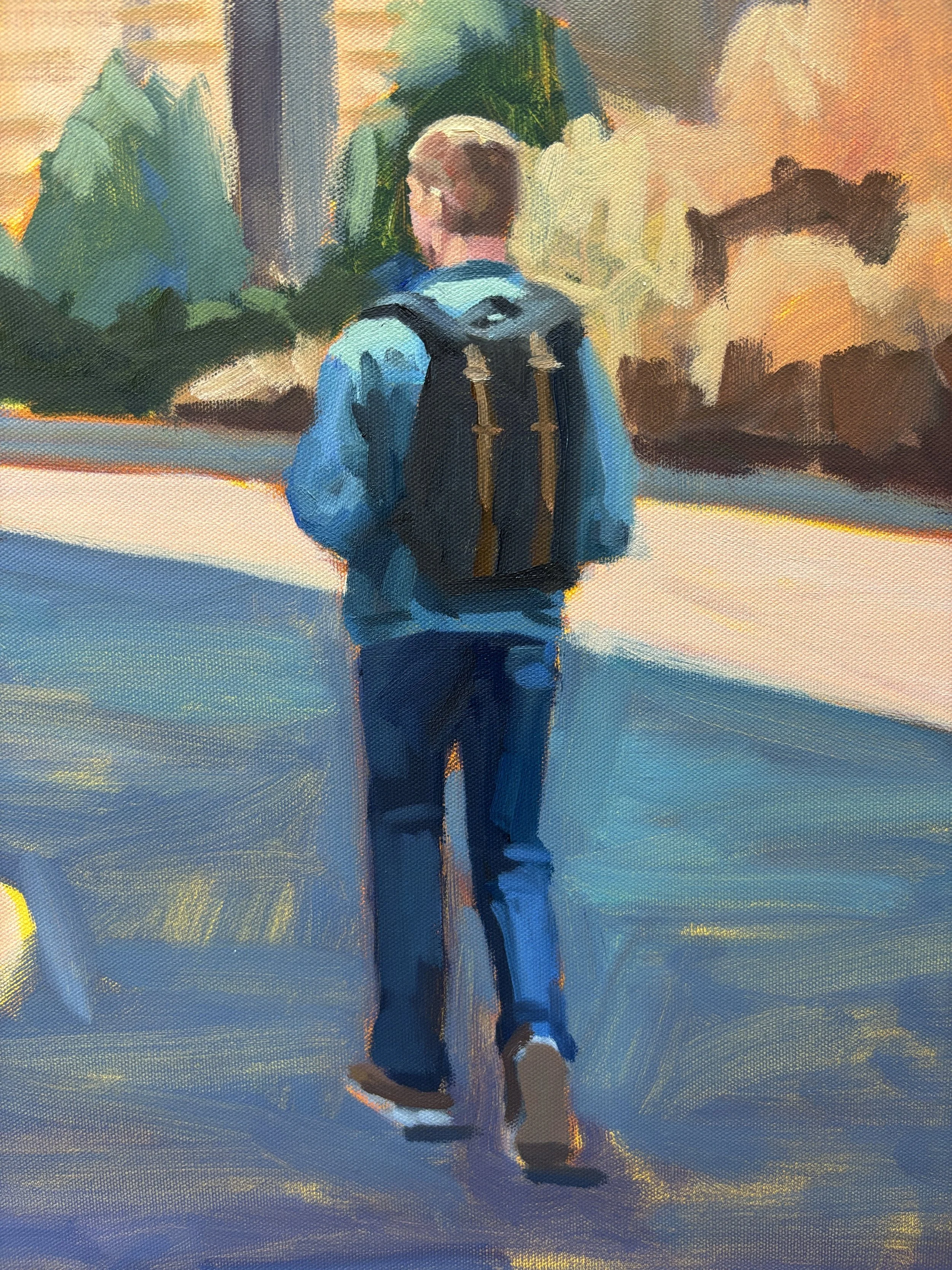
Detail 4
7/24/25
Hi Michael,
Yes my trip to Milan was wonderful, and my Italian has improved considerably. Thanks for asking!
Since then I’ve made progress on your painting, fine-tuning the colors and values and detail. The figure of Aubrey is essentially complete.
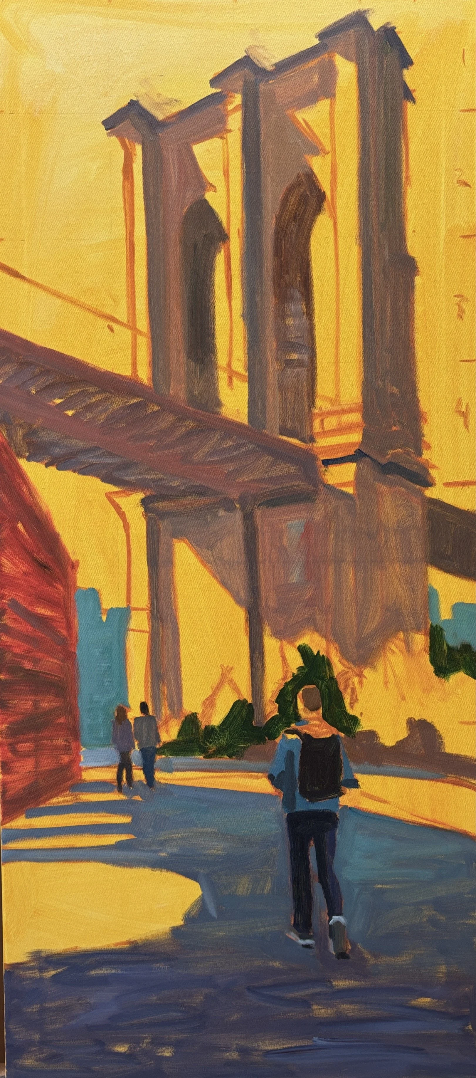
6/13/25 color block-in.
Detail 1
Detail 3
Actually, I had expected to make more progress by now but I had some family issues. While I was in Italy my 96-year-old mother had a heart attack. After the hospital, rehab, and being at home for a week she had another attack. Now she’s home with aides and doing okay. But I’m finding being a caregiver and managing her care is time-consuming and emotionally draining.
So I’m continuing work on your painting, just at a slower pace than normal. I’m really liking how its turning out and I expect to be finished in the next month. Then I’ll get your input, let it dry, varnish it, and it will be ready for shipping. I appreciate your patience.
In the meantime, please let me know if you have any comments using this link. I can’t wait for you all to see your painting in person!
Best, Linda
Progress to date
Detail 2
Detail 4
6/13/25
Hi Michael,
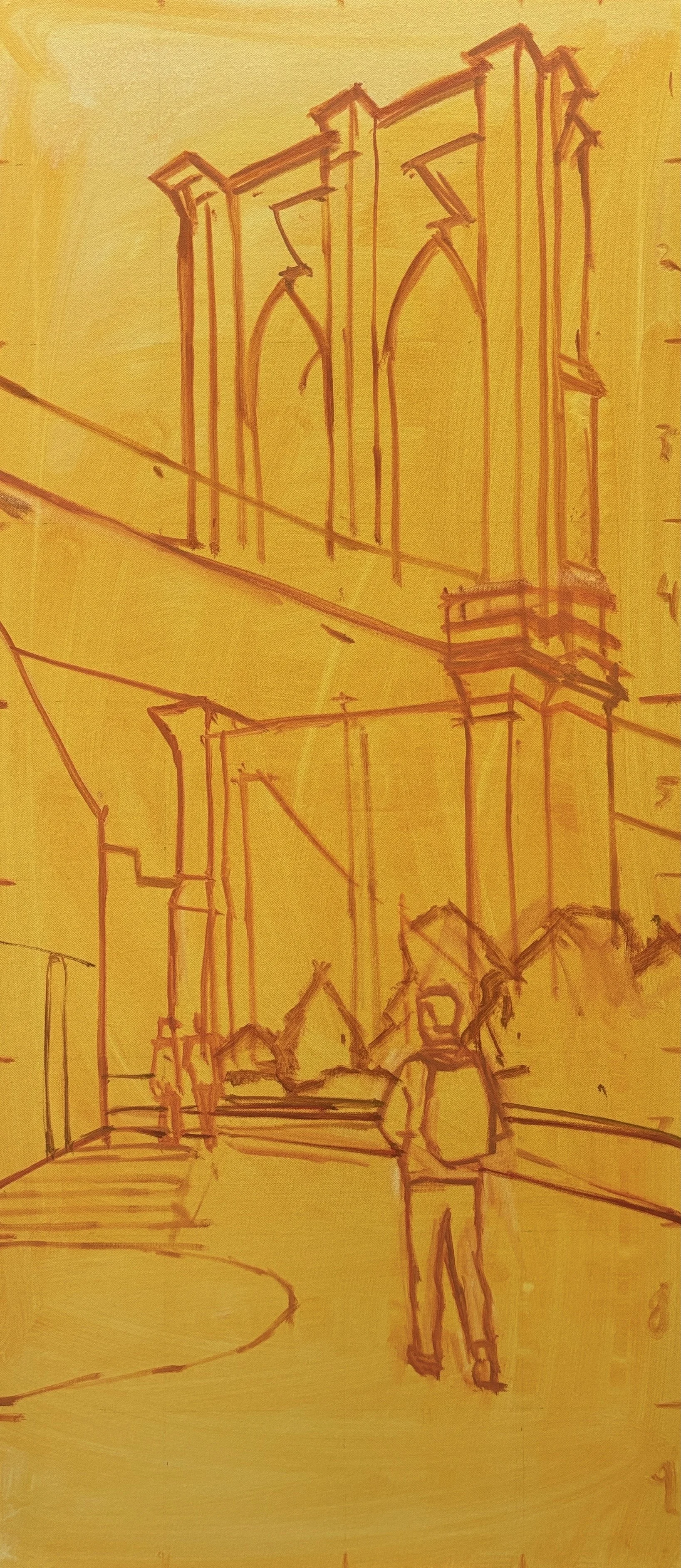
I’ve completed the color block-in. This is when I mass in the main colors to check their relationships in terms of value and intensity.
This stage usually follows the color sketch pretty closely, but there are always differences. That for me is the essence of painting; reacting to the painting in the moment and making changes that seem necessary.
Golden underpainting and drawing.
From here I’ll do a lot of refining of colors, values, and edges, as well as add detail in the focal areas. But this is a good time to get your input.
Does anything bother or concern you? I’m looking for any and all input. Email me your comments with this link. I’m looking forward to hearing your thoughts!
Best, Linda
The start of the block in with dark values.
Full block in.
5/15/25
Hi Michael,
Your color sketch is finished! This sketch is to decide on the overall color palette of the painting.
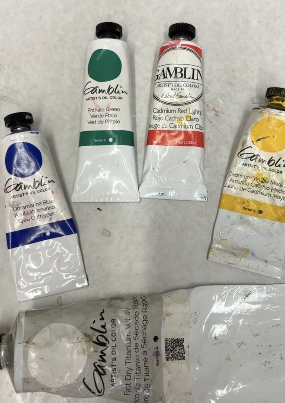
I like to use a limited palette, because it creates color harmony for neutrals and brighter colors. For this painting I only used four colors plus black and white:
Cadmium red light
Cadmium yellow medium
Ultramarine blue
Pthalo green
Color sketch in oil.
The concept: I made the color sketch quite a bit more colorful than the original photo to make it more emotional and eye catching. But I did keep the original palate of colors in the photo: the brick building, the orange shrubs, and the aqua of the distant buildings.
I’m very pleased with the way this turned out and I think it will make a great painting. So, what do you think? Just send me and email with this link.
Once you approve this, the next step is to start the full size painting. I’m looking forward to hearing your thoughts!
Best, Linda
Digital value sketch.
Approved edited photo.
5/1/25
Hi Michael,
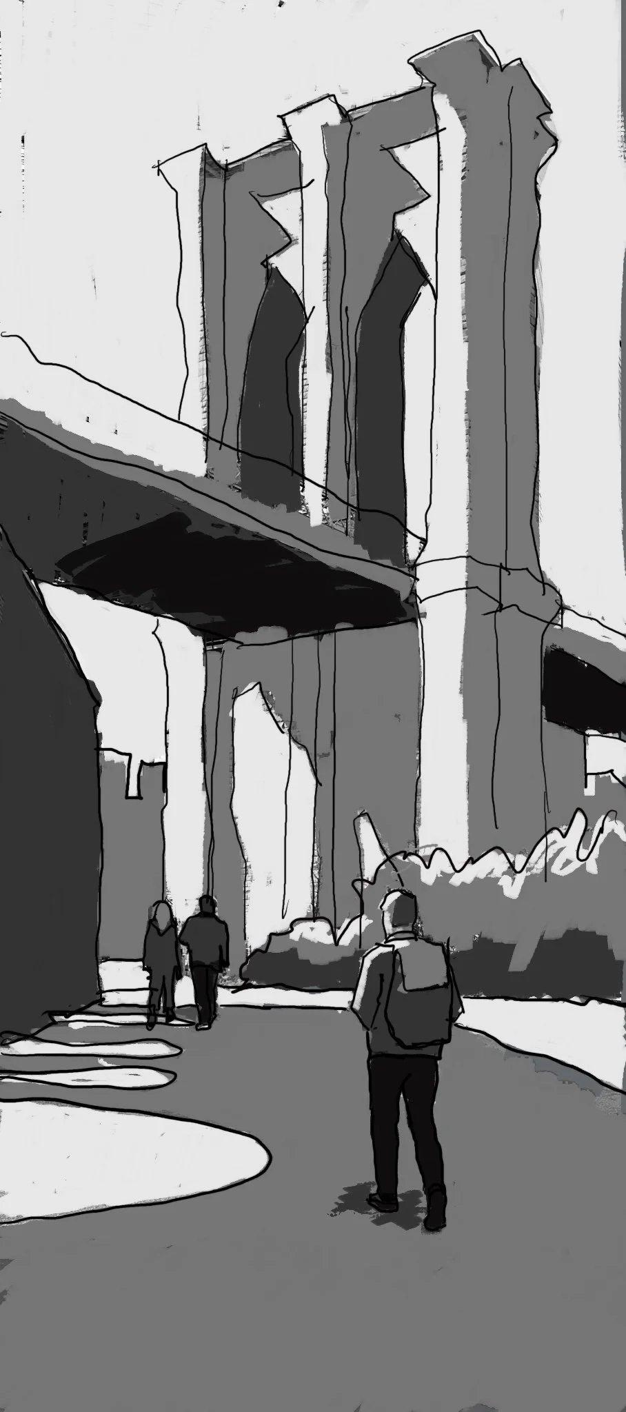
Your value sketch is finished. This sketch is actually the foundation of the painting, because it shows how the painting will be read from a distance, and it’s what determines how your eye moves around the canvas. From here, all the color and details will support this design concept..
The concept:
I simplified the design to only four values to make the large shapes very strong.
You can see that by making some of the shadows a little darker than you see in the photo, we get some really interesting large shapes that add complexity to this tall painting. I love the curves of the open arches in the ground shadow, and the shadows on the pylons.
Organizing the values directs the movement of the viewer’s eye, which starts at Aubrey (because we are drawn to figures), then it looks at the large bridge pylon, and then moves horizontally through the mid-ground details, and finally circles back to Aubry.
Aubrey is the focus because he’s a figure, he’s large in the foreground and he is a dark value.
So, what do you think? Just send me and email with this link.
If you like this, the next step is for me to do a small color sketch.
I’m looking forward to hearing your thoughts!
Best, Linda
Digital value sketch.
Approved edited photo.
4/24/25
Hi Michael,
Welcome to your commission webpage! This is where we’ll communicate about your commission so we always have a record of all our previous steps and approvals. You can’t write on this page but you can send an email to me with this link.
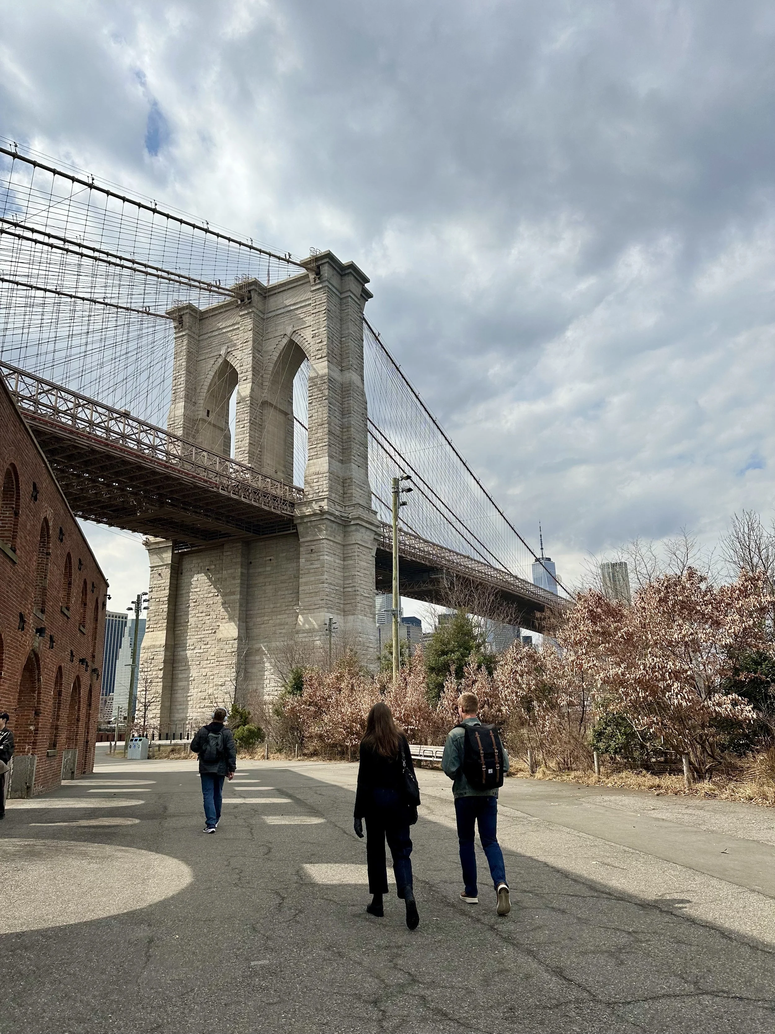
So, I’ve review all your great photos and I have a favorite:
Original photo of Brooklyn Bridge
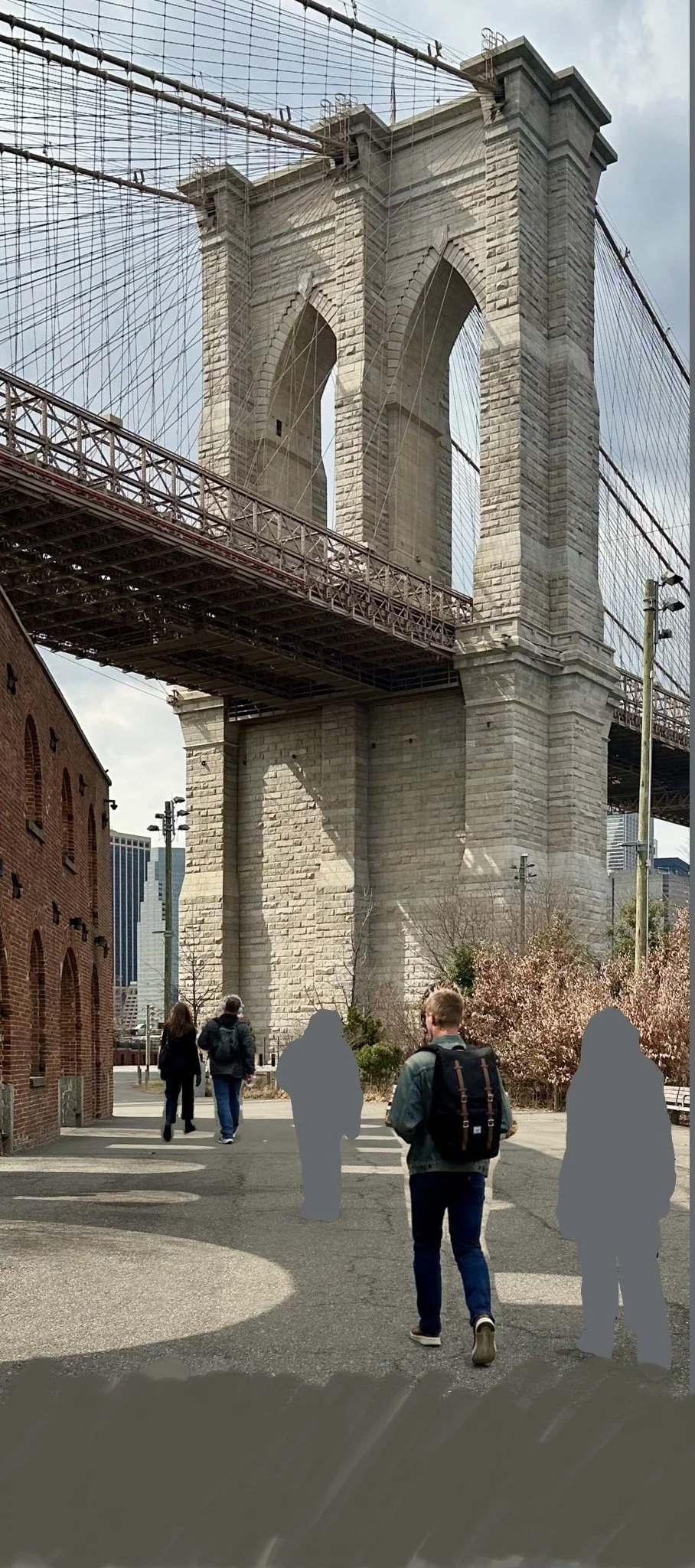
I like this image best because it has a strong vertical format with the large shape of the bridge pylon. And it also has other interesting shapes and diagonals. It features have a interesting angled view of Aubrey, with light on his left side and hair. I’m also excited about the sunlight in this scene of the Brooklyn Bridge, especially on the pylon and the shapes of the shadow on the walkway.
Here’s how I edited your image for the painting:
Cropped to the correct proportions
Moved the figures. I did keep two figures in the background just for scale and a bit of interest. I assume we want the focus to be on Aubrey.
Added space in the foreground so Aubrey’s not so close to the bottom
So, what do you think? Just send me and email with this link.
If you like this, the next step is for me to do a black and white sketch to continue to work out the composition.
I’m looking forward to hearing lyour thoughts!
Best, Linda
Edited image

